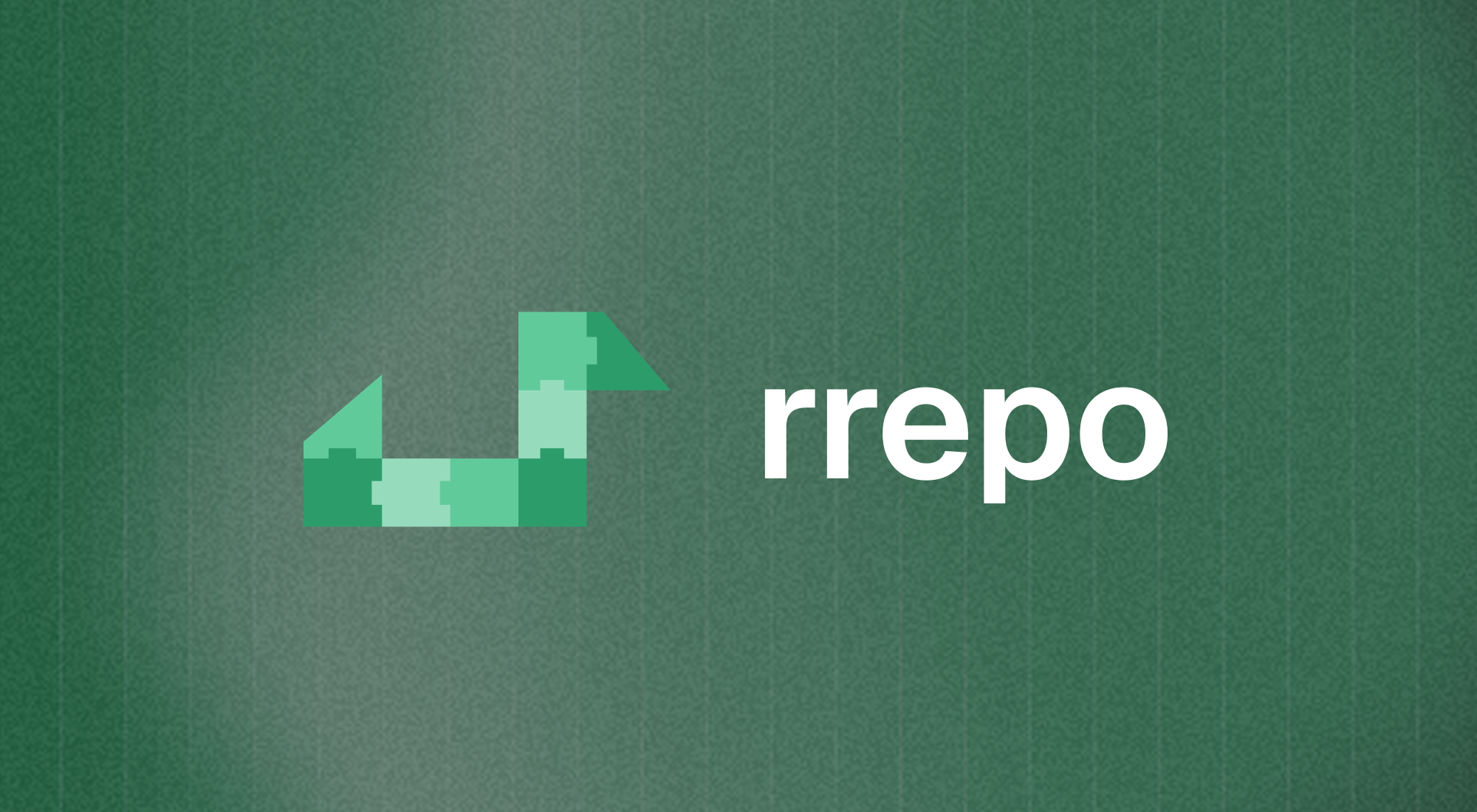
rrepo: two Rs, one swan.
rrepo is a package manager for the R language and a Scalerail product. I designed its Brand Essentials: a logo, typography and color system, delivered through a brand guidelines dashboard.
The brief asked the logo to communicate compatibility, confidence, precision and packages, while incorporating the letter R.
Two Rs, one swan
After exploring several concepts, we settled on a swan mascot built from two Rs. One R is angled to form the swan’s body.
Both letters are made from interlocking puzzle tiles. The pieces fitting together represent compatibility and the packages rrepo manages. Sharp edges give the mark its sense of precision.

The swan combines two Rs and interlocking package tiles.

The color system supplied with the identity.
Guidelines built for use
I delivered the guidelines as a dashboard, giving Scalerail a place to return to when using the identity.
It brings together the brand overview, logo, typography, colors, voice and tone, and usage guidelines. Download buttons sit alongside the assets, so the files and their guidance are available in the same place.
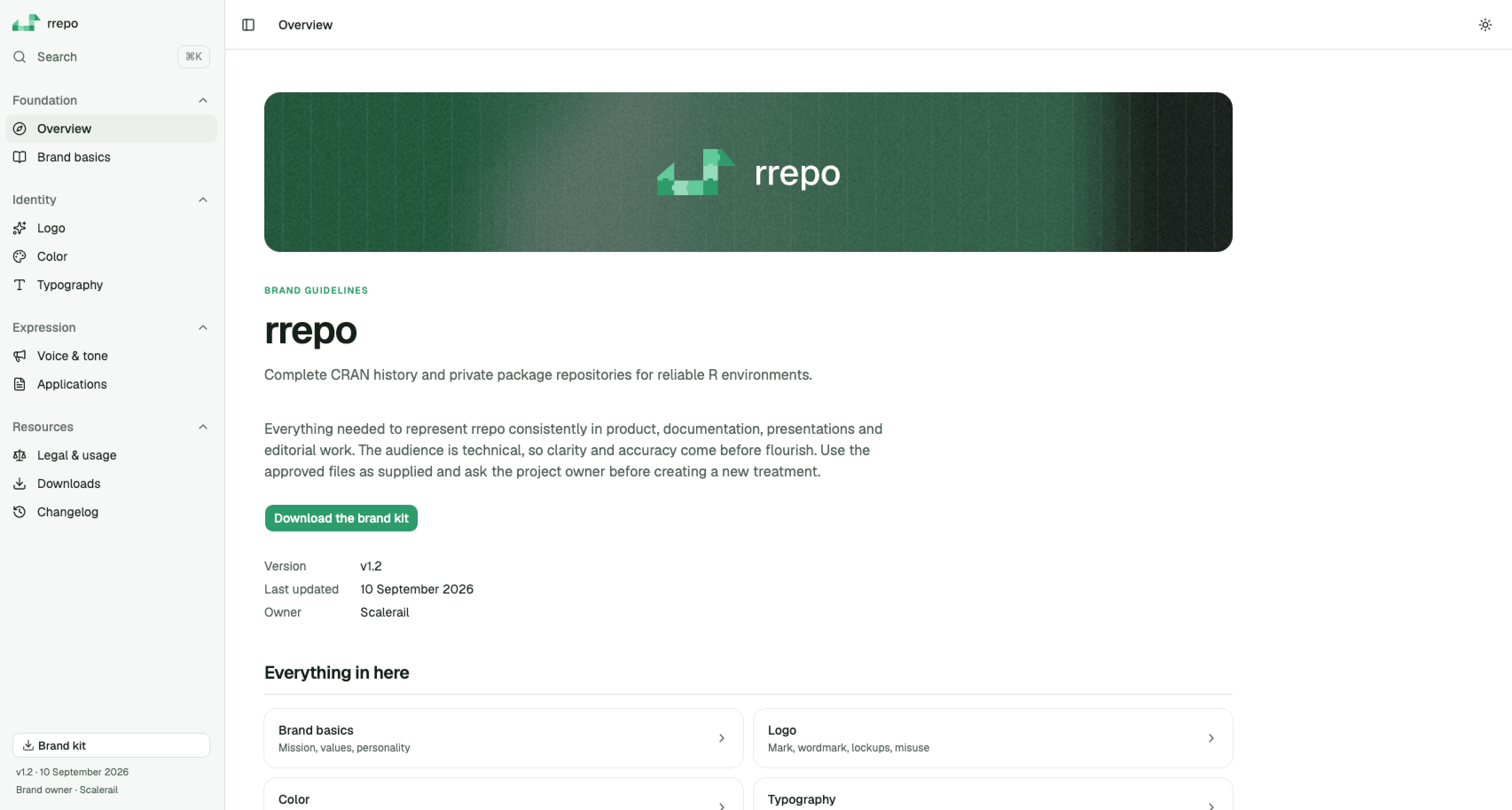
The overview introduces the identity and gives access to the brand kit.
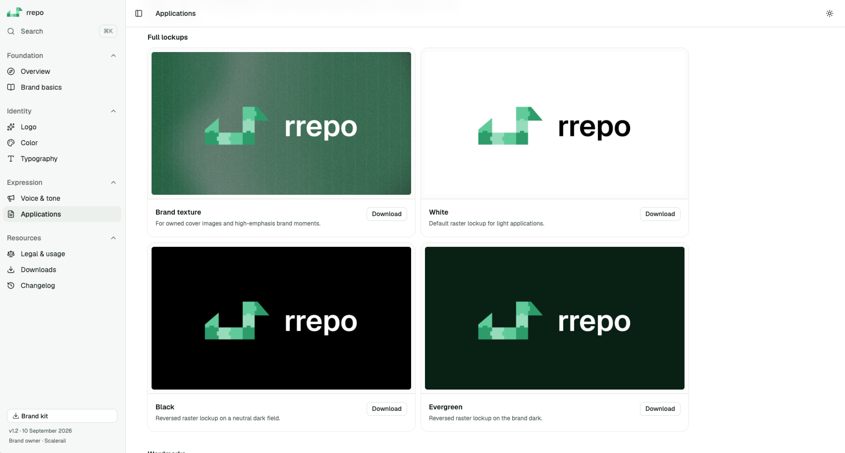
Approved lockups, their intended uses, and individual downloads.