CoDuck: a clearer workspace for building with AI
CoDuck brings AI app building together with the tools behind a working product: data, payments, hosting and more. Its interface needed to make that breadth easier to understand. The chat dominated the workspace, project controls were difficult to find, and the difference between a working version and the live site was easy to confuse.
I redesigned the dashboard around the project, its AI conversation and the result being built. The work gave CoDuck a clearer structure for its growing product, with direct access to tools that had been buried behind the chat. Liam’s feedback captured both the response to the preview and what the collaboration meant for him:
“Deniz turned our confusing product UI into a dashboard users already love, even in preview. I came in with no clear direction, but he took ownership, responded quickly, and stayed patient through every change. I barely had to manage anything.”
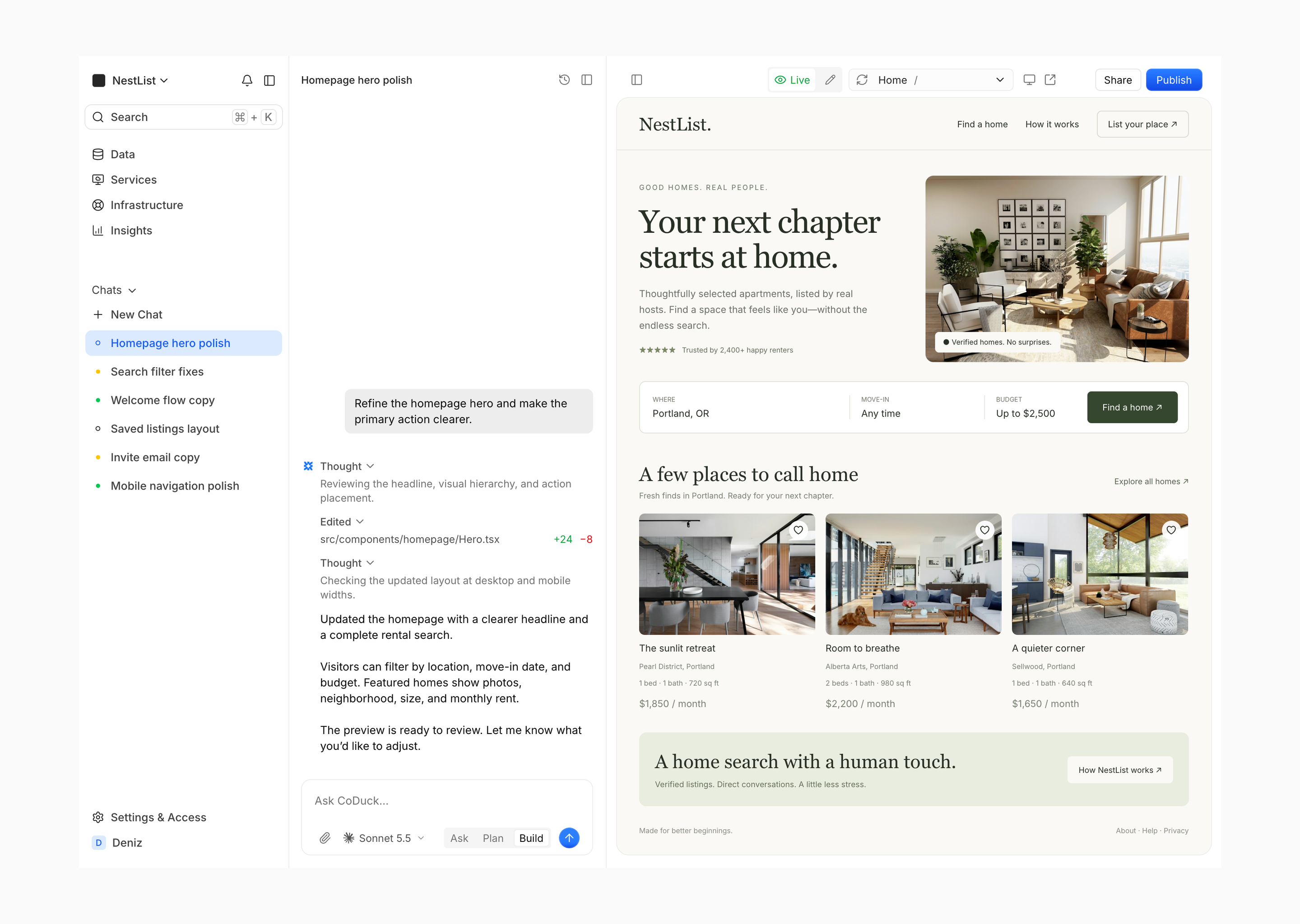
The project, the conversation and the result, together in one workspace.
Make CoDuck’s capabilities easier to find
CoDuck’s Cloud panel held project settings, domains and services under one broad label. That made it hard to know where to go, especially for work like payments that people may want to manage directly.
I reorganized them into Data, Services, Infrastructure and Insights, with project navigation separate from conversations. This made CoDuck’s capabilities visible as part of the product, with a structure that could accommodate more tools as it grew. Search and a command palette provided a direct route for people who knew what they needed.
Builders could also hide the sidebar and close the preview to focus on a conversation. The same workspace supported managing the app and working with AI, without forcing either activity to take over the entire interface.
Keep builders in control of their app
An AI builder still needs useful controls when someone wants to make a change directly. Liam raised a concrete example: people might run out of credits while creating a form. I added a manual creation panel where they could work on fields while keeping the existing forms list in view.
The data views followed the same principle. I standardized table layouts and distinguished assets uploaded by the builder or agent from files uploaded by the app’s users. Those changes made the management side of CoDuck easier to follow as a project accumulated more information.
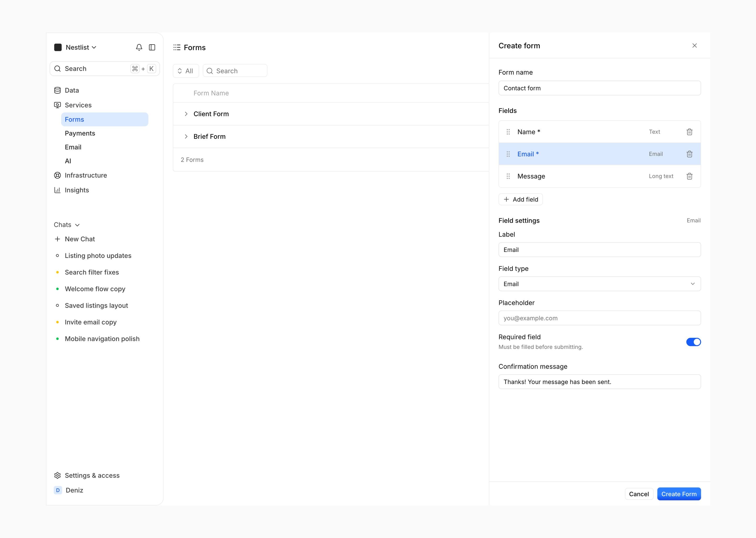
A direct way to create a form, alongside the AI workflow.
Help builders understand what is live
Liam shared that a nontechnical tester was confused by seeing two versions of her website. Each chat could have its own working version, while the project still had one live site. I proposed “Workspace” and “Live” in place of “Worktree” and “Production,” and worked with him on making that distinction visible in the preview.
Publishing feedback focused on what builders needed to know: whether publishing was underway and when it had finished. I also proposed keeping the previous preview visible while an update was being generated, with startup and errors treated as separate states. These proposals addressed specific points of confusion during implementation; they had not yet been validated after launch.
Bring the platform into one product
The redesign extended from the main builder into services and account settings. Shared layouts and controls gave those areas a common visual language, so the breadth of CoDuck could read as one platform.
The account area also had room for more character. Liam wanted referrals to feel collectible, so I designed a membership-style card while keeping the referral link, code and explanation straightforward. This gave that part of the product its own identity within the wider dashboard.
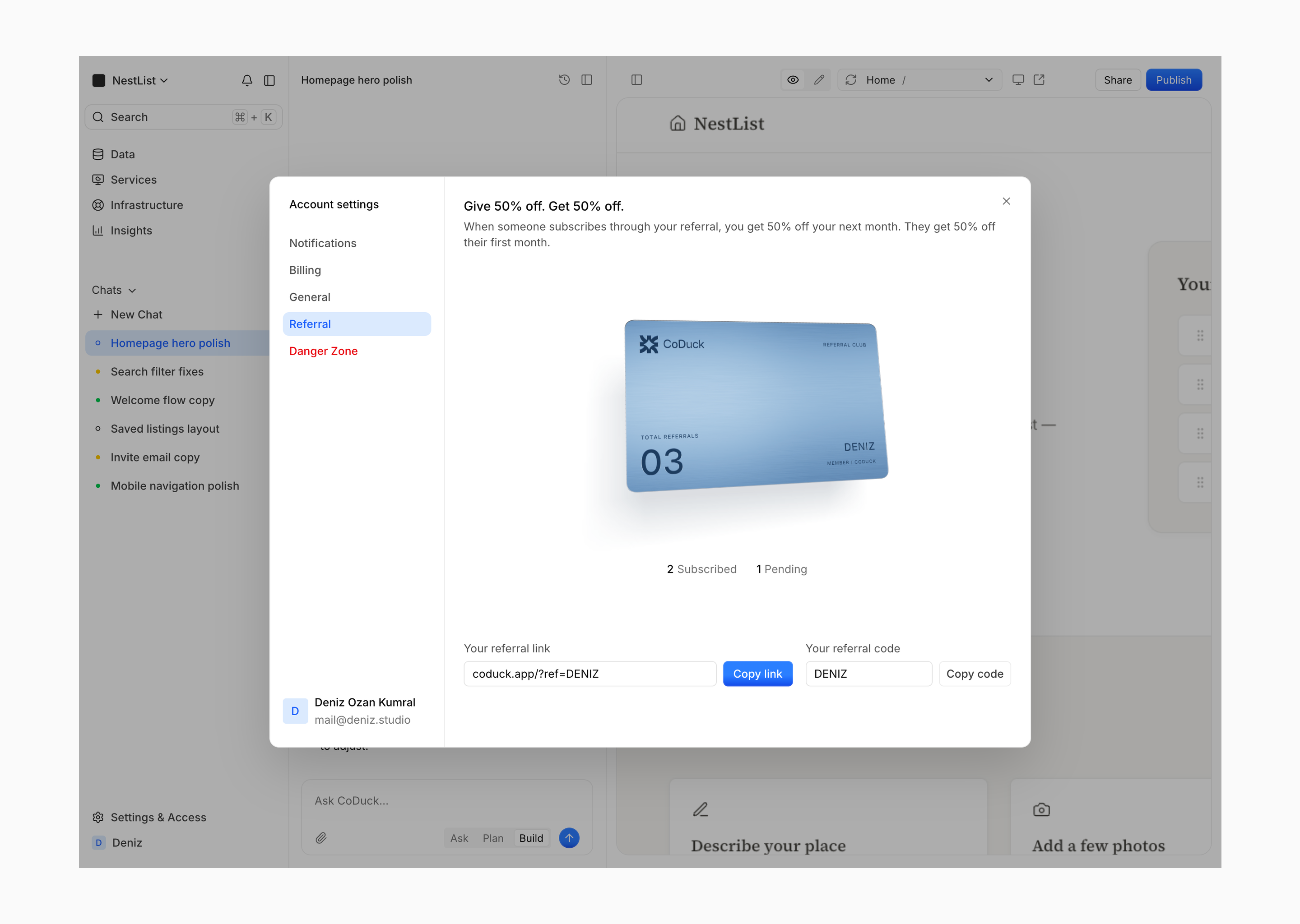
An expressive moment in the account area, with the referral details kept clear.
Give the founder a clear path into implementation
The handoff covered the behavior needed to build the product, including collapsed layouts, long chat responses, empty states and menus. I designed in Paper with Tailwind variables and tokens, used Codex for the overview and animation prototypes, and reviewed and refined the direction. Liam handled the product implementation with Codex.
By October 9, Liam reported that most of the designs had been transferred into a development build. His testimonial describes a dashboard people already liked in preview and a collaboration that required little management from him.
The redesign had not launched at the time of writing. Its result so far was a clearer product structure and a development build carrying the new direction. Post-launch product metrics were not yet available.