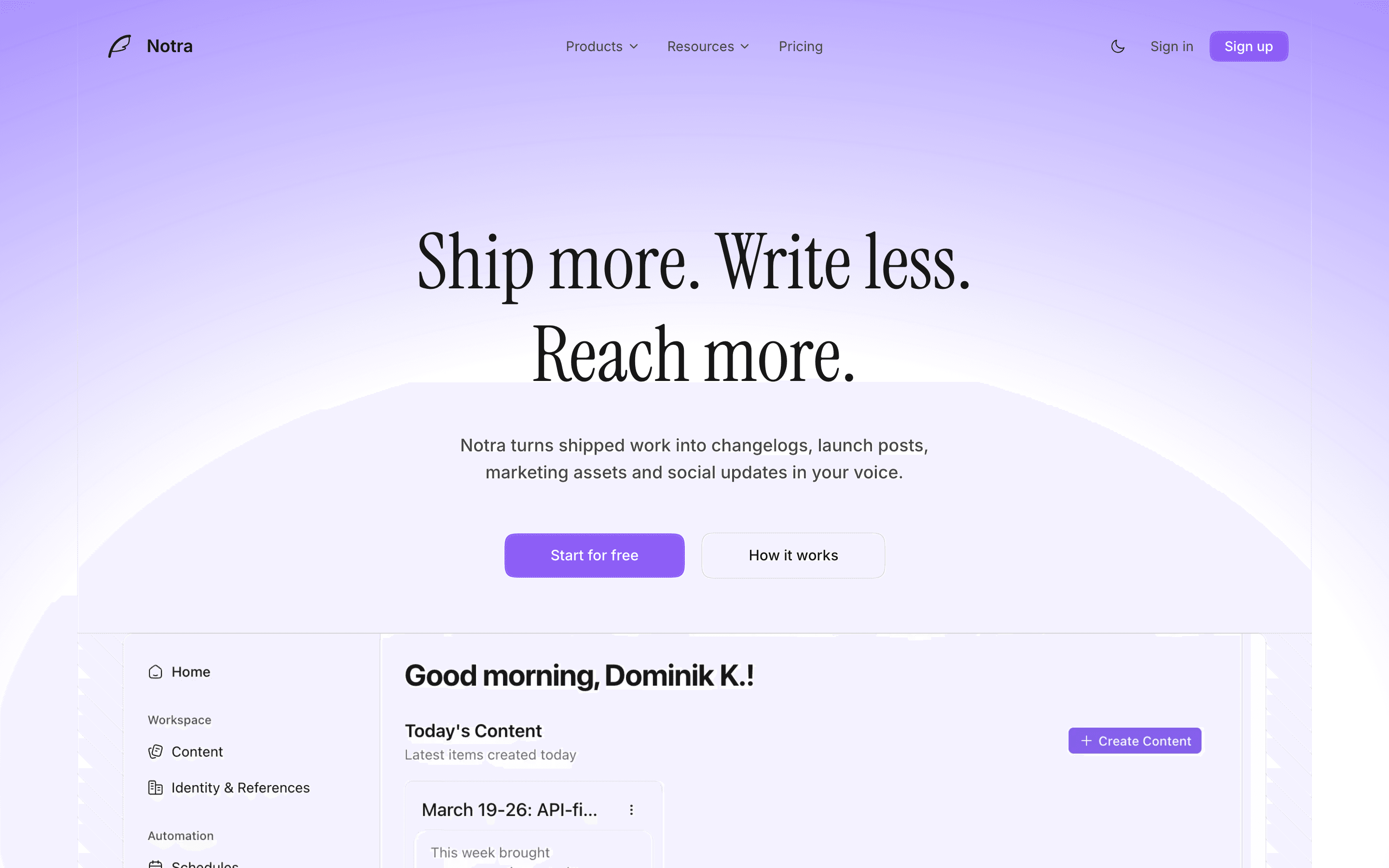
Notra is an AI marketing pipeline for startups. Its old landing page was built from a v0 template. It looked generic, was difficult to extend, and did not feel like the product behind it.
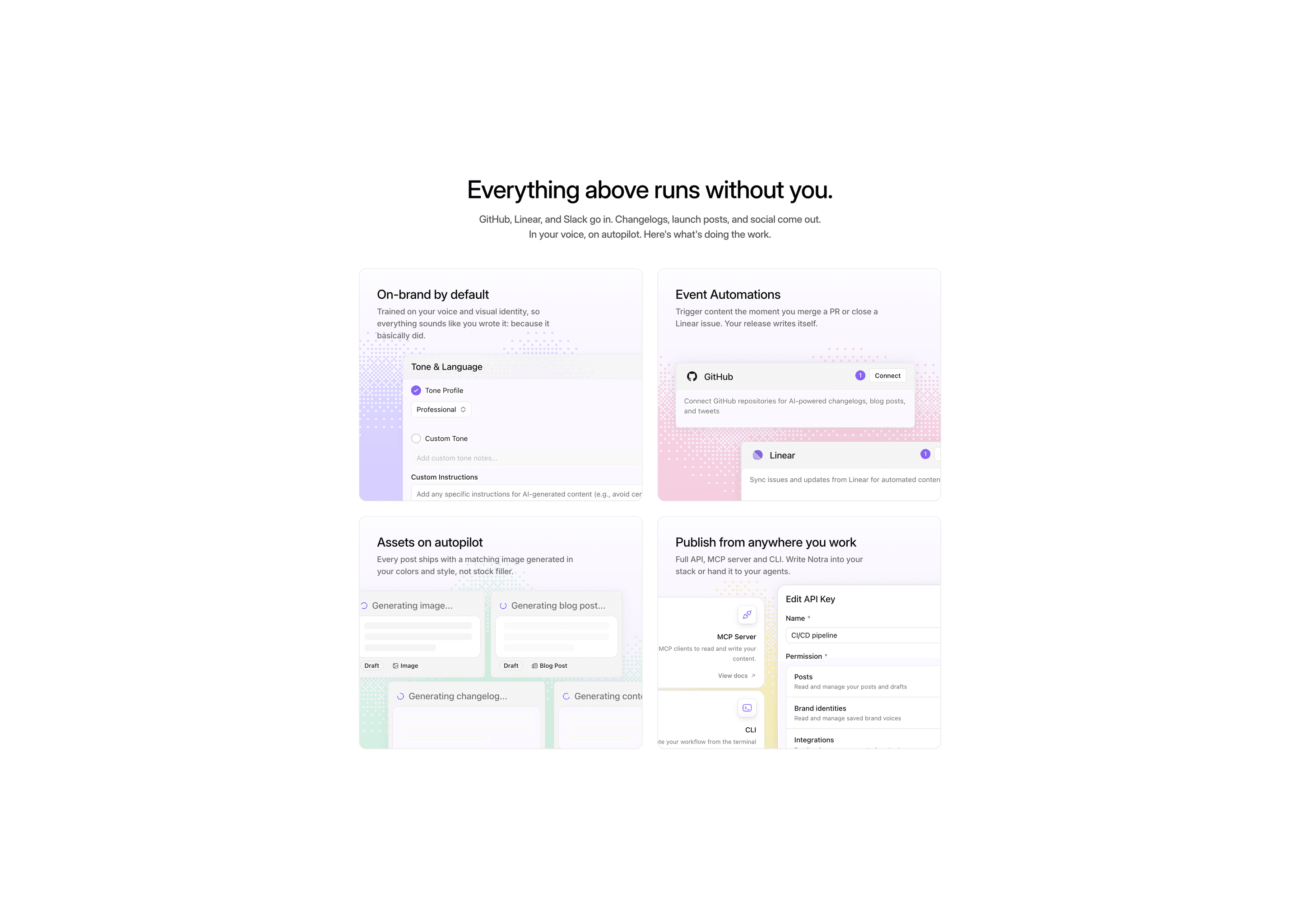
I redesigned the page around Notra's real product UI and built a visual system that could carry the same identity from the hero down to a small card detail.
“My old site was a v0 template. Deniz created something new that actually looks like us, and kept me in the loop the whole way, no guessing. The dither details completely won me over.”
Before
Dominik described the old site as AI-made and hard to build on because its foundation was weak. He also felt it was not converting well. He was implementing the redesign himself, so the handoff had to make the intended behavior clear.
Building the identity from the product
The identity did not start with a decorative graphic. It came from Notra itself: real interface components, the brand-adapted content it produces, and a dither treatment that became the page's recurring detail.
The dither moved from the feature cards into the testimonials and other details across the page. Together with the product UI, type, and color, it gave the sections a shared visual language.
Three decisions that shaped the page
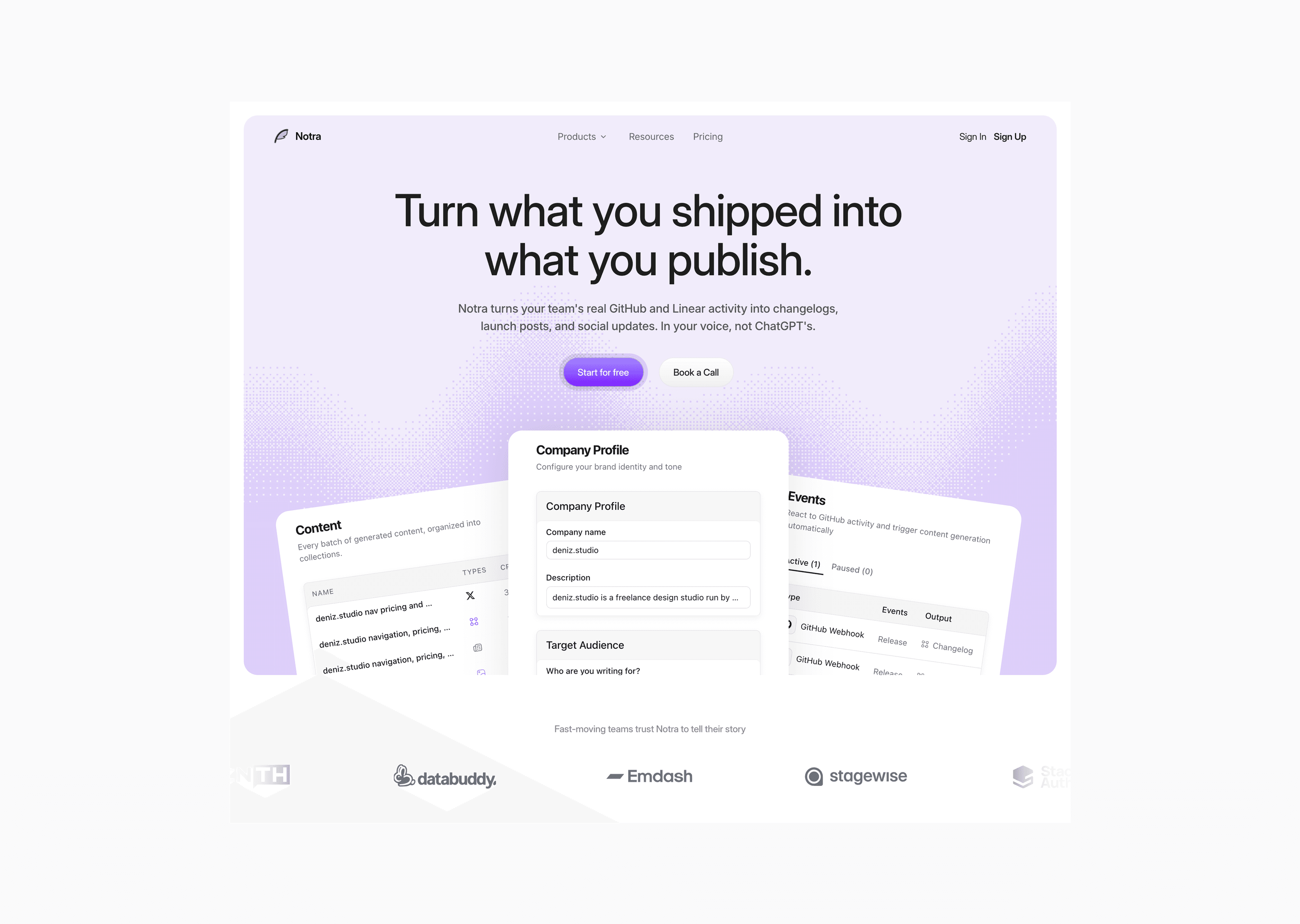
Show the product in the hero
I built the hero from three real parts of Notra: a post preview adapted to a company's brand, the available post formats, and the sources feeding the pipeline. This gets the product's main idea across without asking visitors to decode an abstract illustration.
A more graphic direction looked promising on its own, but it clashed with the dither system and could not hold the dashboard information the hero needed.
Dominik questioned whether the company profile should have that much focus and later suggested turning the hero into a carousel. I pushed back. The brand-adapted output is central to Notra, and making visitors cycle through the hero would keep them there longer when the page should already be moving them forward. He agreed.
Make the feature cards feel like one composition
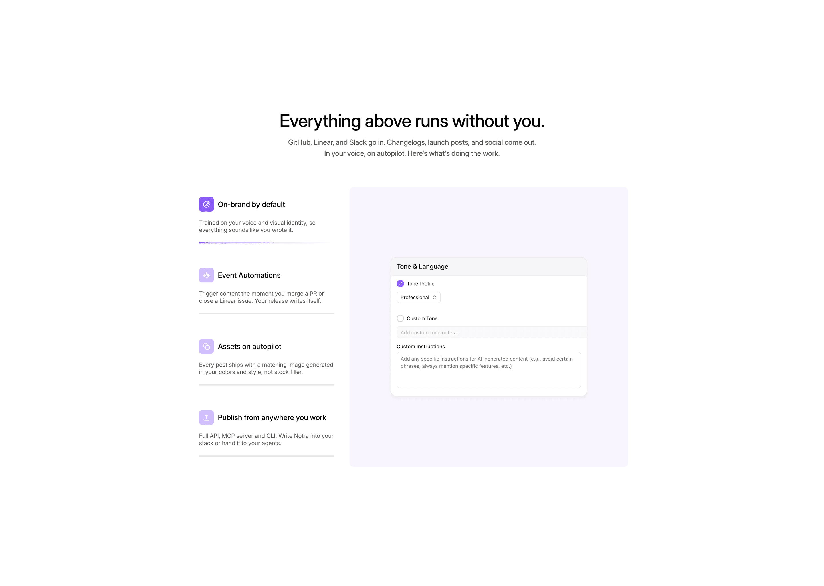
Simple stacked cards felt detached from the rest of the page. I cropped them against the section edges and arranged the corner dithers so they point inward, turning the cards into one composition.
Getting there took more attempts than the final detail suggests. We tried lightly tinted cards, then fully colored versions. One felt too timid and the other pulled too much attention. The final corner dither kept the color and depth without competing with the content.
Let people carry the trust
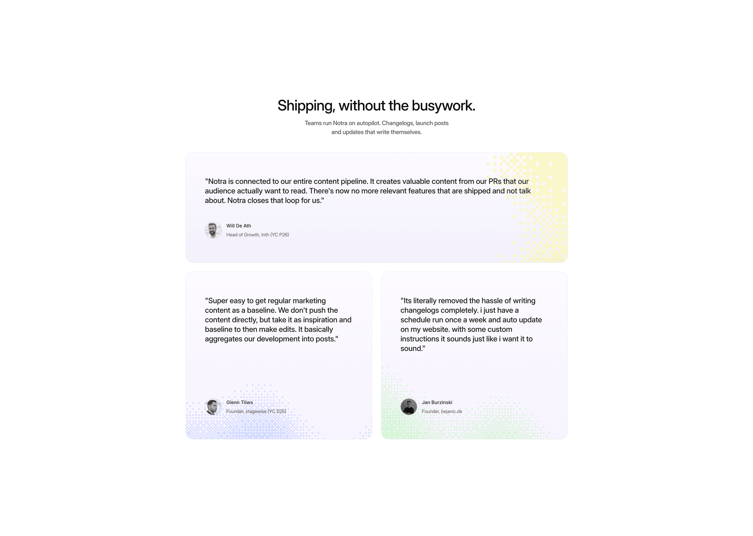
The main disagreement was about testimonials. Dominik preferred company-led cards. I wanted to lead with the person because Notra's customers were credible startups, but their names alone would mean little to a cold visitor.
The final cards put the person first, keep the role and company in the attribution, highlight the key phrases, and use each company's color as a dither in the background.
Handoff beyond the mockup
Paper could not represent every part of the final behavior. Large numbers of dither effects sometimes stopped rendering, and the tool could not show clickable text links or the intended text emphasis.
Dominik implemented the site, so I handed over the finished file with a short implementation checklist: brand-purple words in the hero headline, highlighted testimonial phrases, linked company names, faded marquee edges, and the hover and active transitions for CTAs and pricing cards.
The result
The new site is live. I am proudest of the page's consistency. It now reads as Notra from the real product components in the hero to the dither sitting in the corner of a card.
The project also changed how I start landing pages. I would collect more references before designing, define the full page flow first, and then resolve each section against that flow. The testimonial discussion reinforced something else: when taste is not enough to settle a disagreement, bring a researched argument and let the stronger case win.
Need a product site that does not look templated?
Let's work together